Good Design Brochure
Class Project
2024
Brief
Assignment
Produce a multi-page brochure about a feature of good design using content derived from our past research on the foundations of good design.
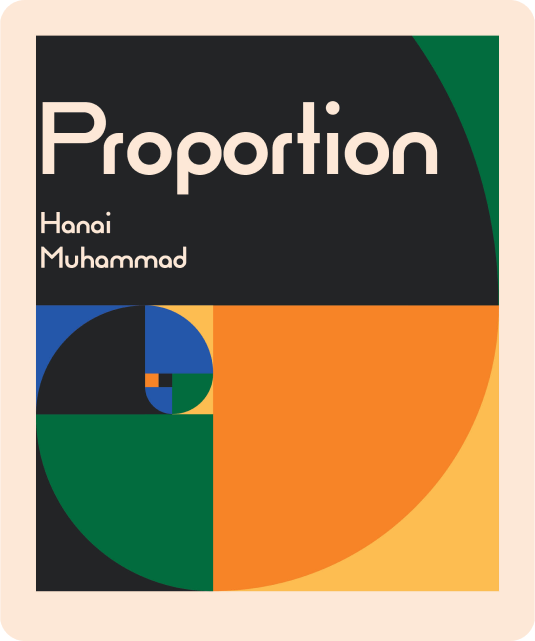
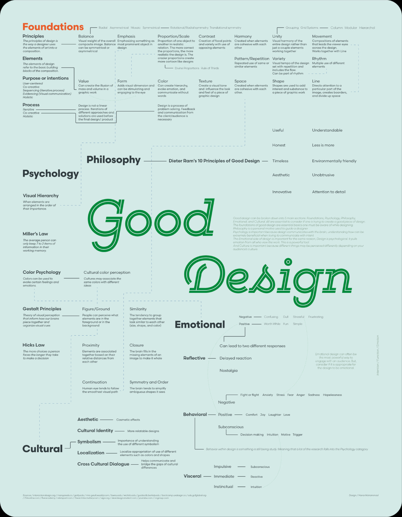
Using a content map that I had previously made about good design, I chose to center my brochure around the topic of proportion in design.
A Brief Idea of the Process
Sketching
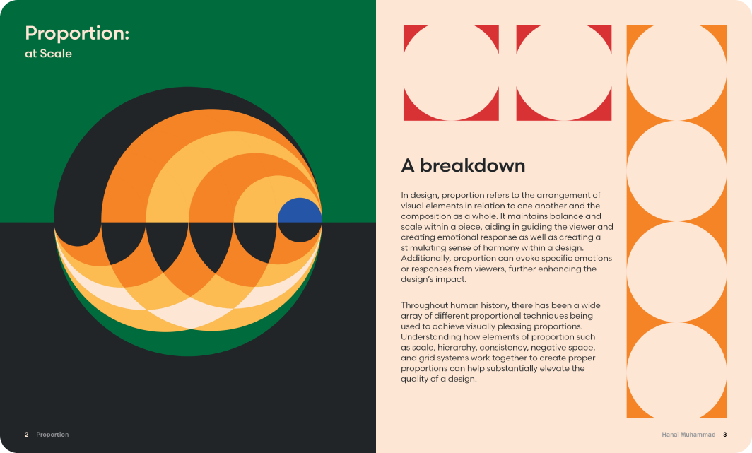
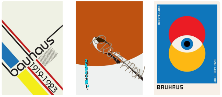
I began by choosing a style. After some exploring, I ended up going with a Bauhaus inspired style because proportional concepts and theories are foundational aspects of original Bauhaus design. I felt that this would align perfectly with my message and enhance the text from page to page with visuals that relate to my content and captivate the reader.
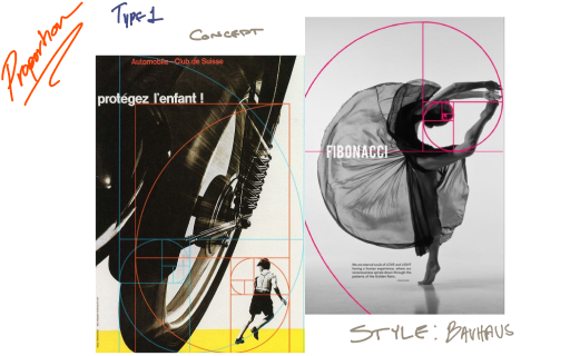
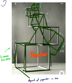
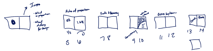
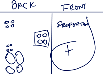
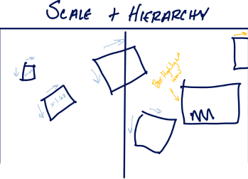
I then made three rough concept sketches using things I found during my style research. My goal was to lay out a set of visuals that will inspire my work and kickstart my spread designs. I felt that there were some strong qualities within each of my original ideas so I chose to combine aspects of all of them and disperse them across multiple different spreads.
Layout
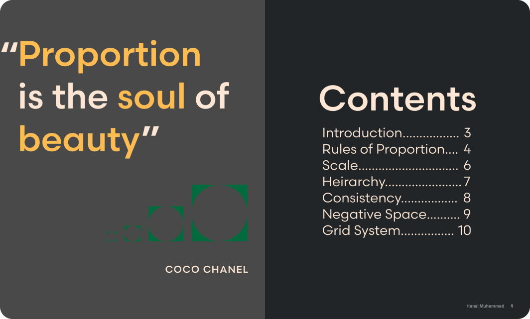
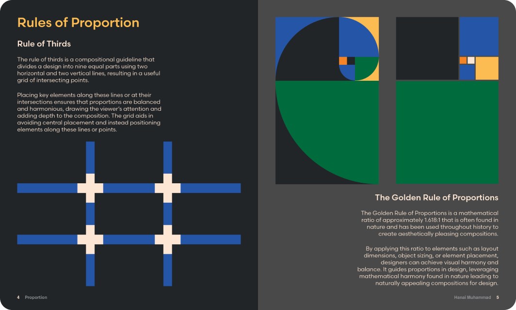
The next step was creating a spread outline to lay out my information. I used research to break proportion into sections diving into the definition of proportion and what it does for design, rules of proportion, scale, hierarchy, and grid systems.
Typeface Choice
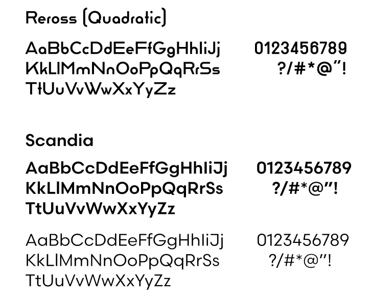
For my penultimate preparation step, I chose two typefaces. I had used Reross for my title font because of its rounded sans-serif style that is commonly associated with Bauhaus typefaces.
The main content uses Scandia because it is easily readable when put into body text. The typeface’s rounded features also still work with the visual language communicated throughout the brochure.


Color Palette
With my foundation set, I created a color palette consisting of some vintage inspired desaturated colors as an ode to the past and complimentary colors to create contrast and emphasis. This color palette in combination with my sketches would help me create a brochure that not only breaks proportion down, but visually demonstrates it as well.
Result
My design layout emulates aspects of music arrangement, using rhythm, tempo, and a visual bridge to create a sense of novelty from page to page while enhancing the literary content and keeping the reader engaged. This project resulted in a 13 page digital and handmade brochure breaking proportion down into simple concepts that can be used by designers to aid in their pursuit of creating good design.